



( 2025 )
Rose & Ray
Plants and Sunlight as Its Identity.
Context
Rose and Ray by Summer Forest is a casual contemporary eatery serving comforting dishes inspired by Modern French cuisine. Located on the fifth floor of Charoenkrung's Reviving Building, the restaurant is conceived as a reinterpretation of Summer Forest, drawing from the warmth and fleeting beauty of sunlight reflecting through nature.
Situated in Talat Noi, one of Bangkok's oldest multicultural neighbourhoods, the project sought to create an identity that felt rooted in its surroundings while expressing a sense of comfort and familiarity.

Approach
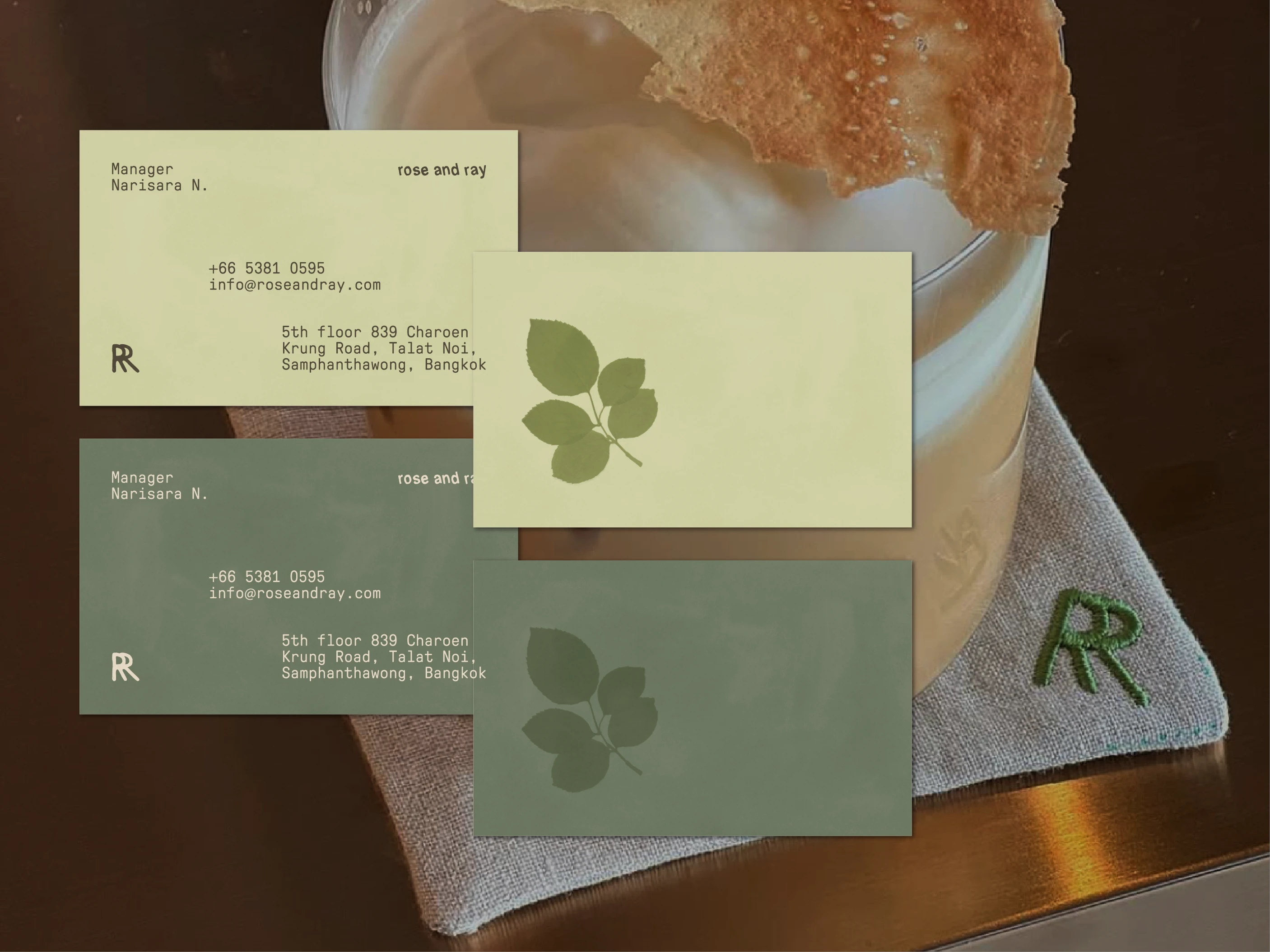
The visual identity centred around anthotype, an environmentally friendly photographic process that uses photosensitive pigments extracted from plants, flowers, and fruits to create images under sunlight. The medium was chosen for its direct connection to the brand's name and concept, making the process itself inseparable from the identity.
Plant selection became a form of site research. Rose, Banyan, Chrysanthemum, Lotus, Water hyacinth, Pennywort, and Jasmine were sourced as living references to Talat Noi's religious diversity, Thai-Chinese heritage, river ecology, and street culture.

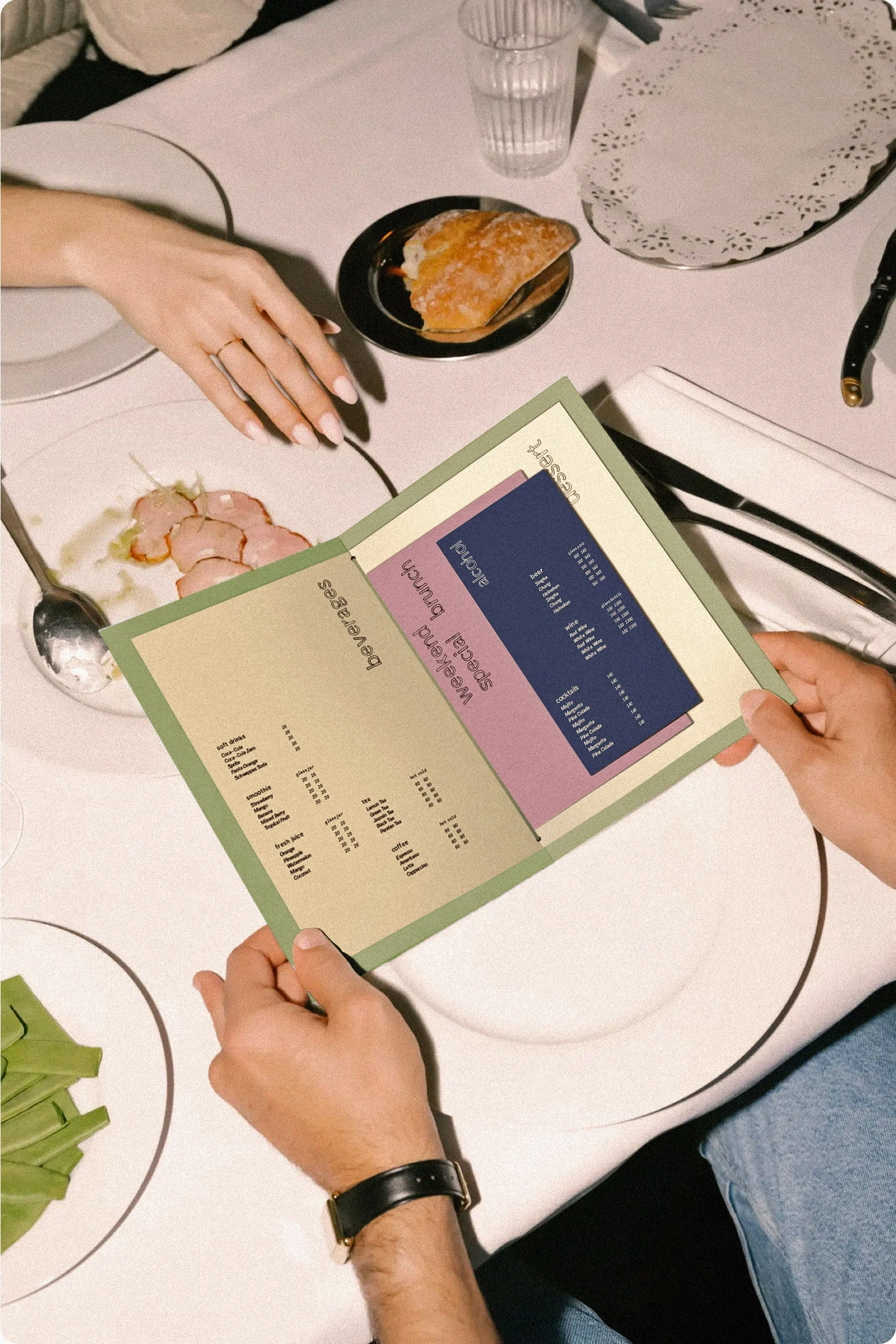
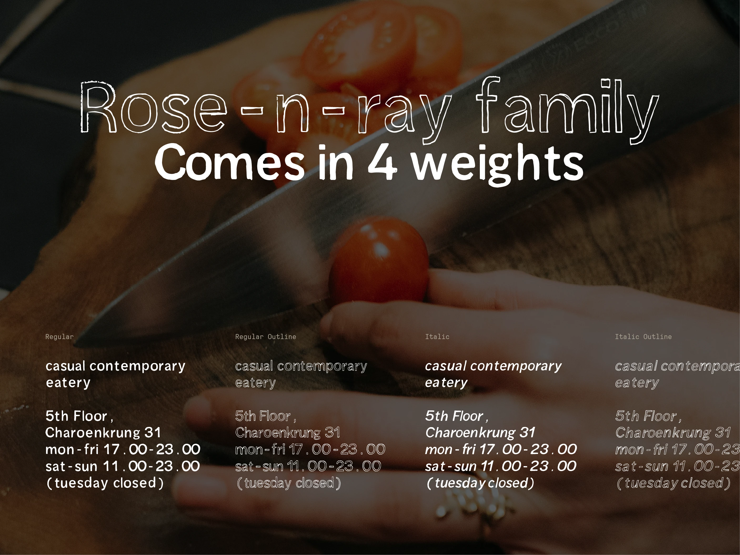
To support the system, a custom typeface, Rose-n-Ray, was developed in four styles: Regular, Italic, Outline, and Outline Italic, allowing the brand to express its casual and adaptable character across menus, printed materials, and digital touchpoints.
Experience
The identity transformed local plants and sunlight into a visual language that could only belong to this place. The materials and imagery rooted the restaurant within the cultural landscape of Talat Noi, while anthotype turned the process of making into part of the narrative, where nature itself became the medium. Under the concept of “Summer Holidays” that invites you to escape the everyday hustle and relax in a serene setting , we visualise it through typography, colour, and imagery, the result was an atmosphere that felt comforting, contemporary, and quietly nostalgic.
Design under
Studio Marketing Materials
Image Courtesy of
The Standard, Another.17th, Dsignsomething
Team member and Type designer
Seungyoon Song
( Service )
Brand Identity
( Client )
Summer Forest
( Indusrty )
Food & Beverage
( Next Project )
Metamorphosis in Gold
